Split
Side-by-side · cover and content balanced
The screen is cut in two: your cover on one side, your details on the other. The photo gets a full half instead of being pushed behind text, and the links get a quiet column with no image competing under them. It is the compromise most people actually want — atmosphere on one side, legibility on the other — and the safest pick when you are not sure how strong your cover photo really is.
Use this template- Type
- Social page
- Plan
- Free
- Cover image
- Comes with its own
More social templates
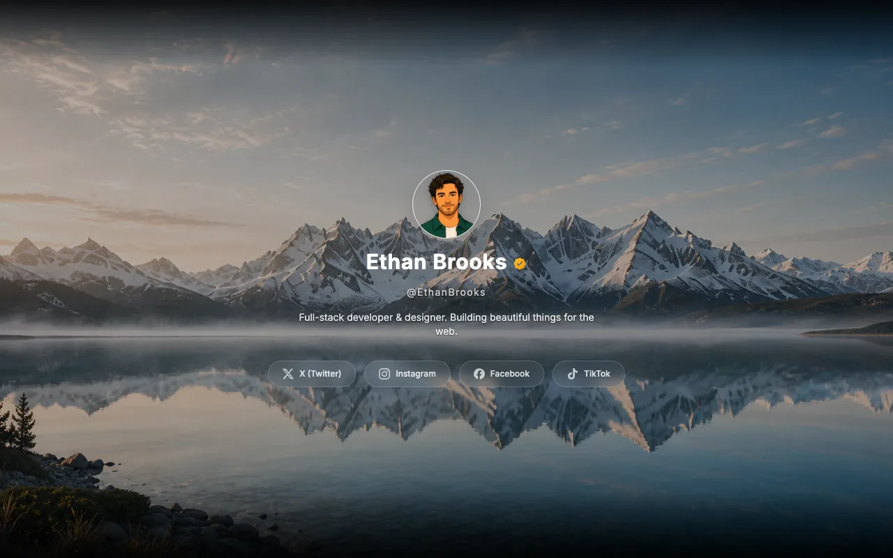
Poster Film
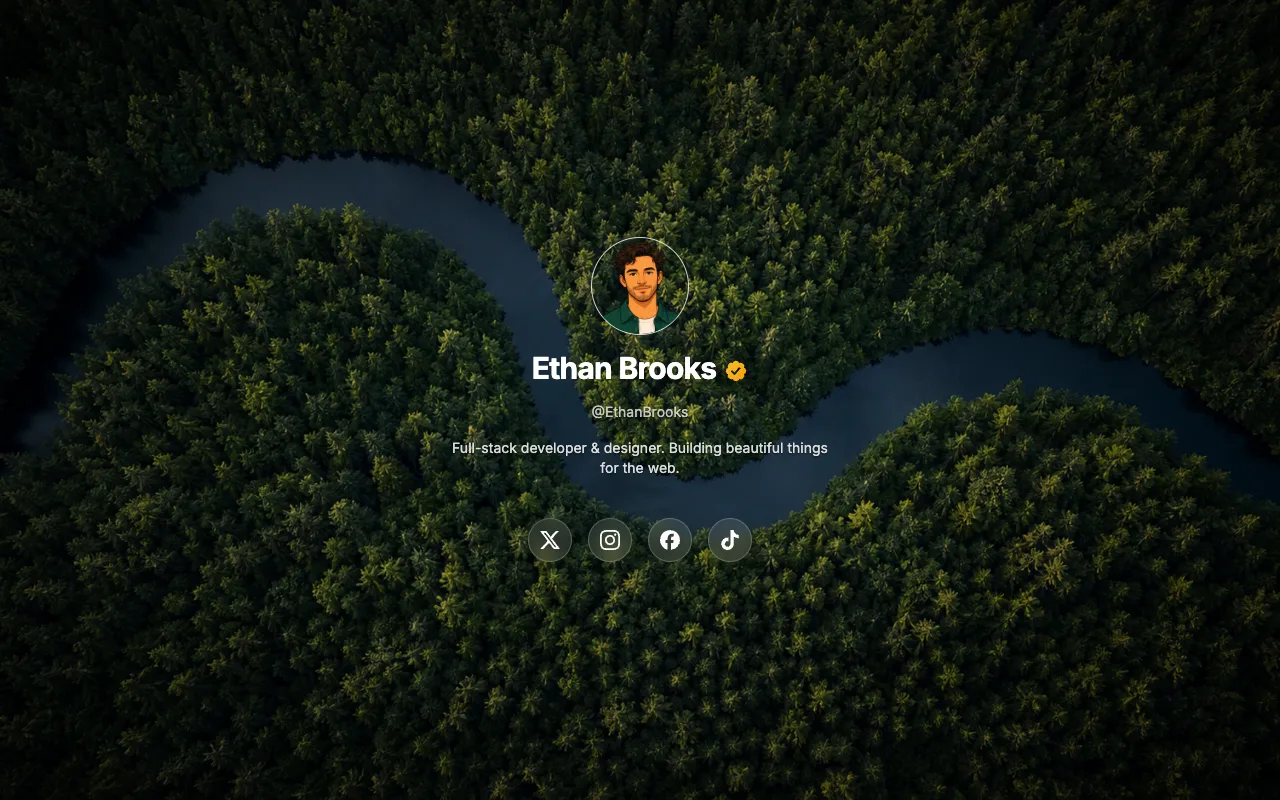
Poster Bold
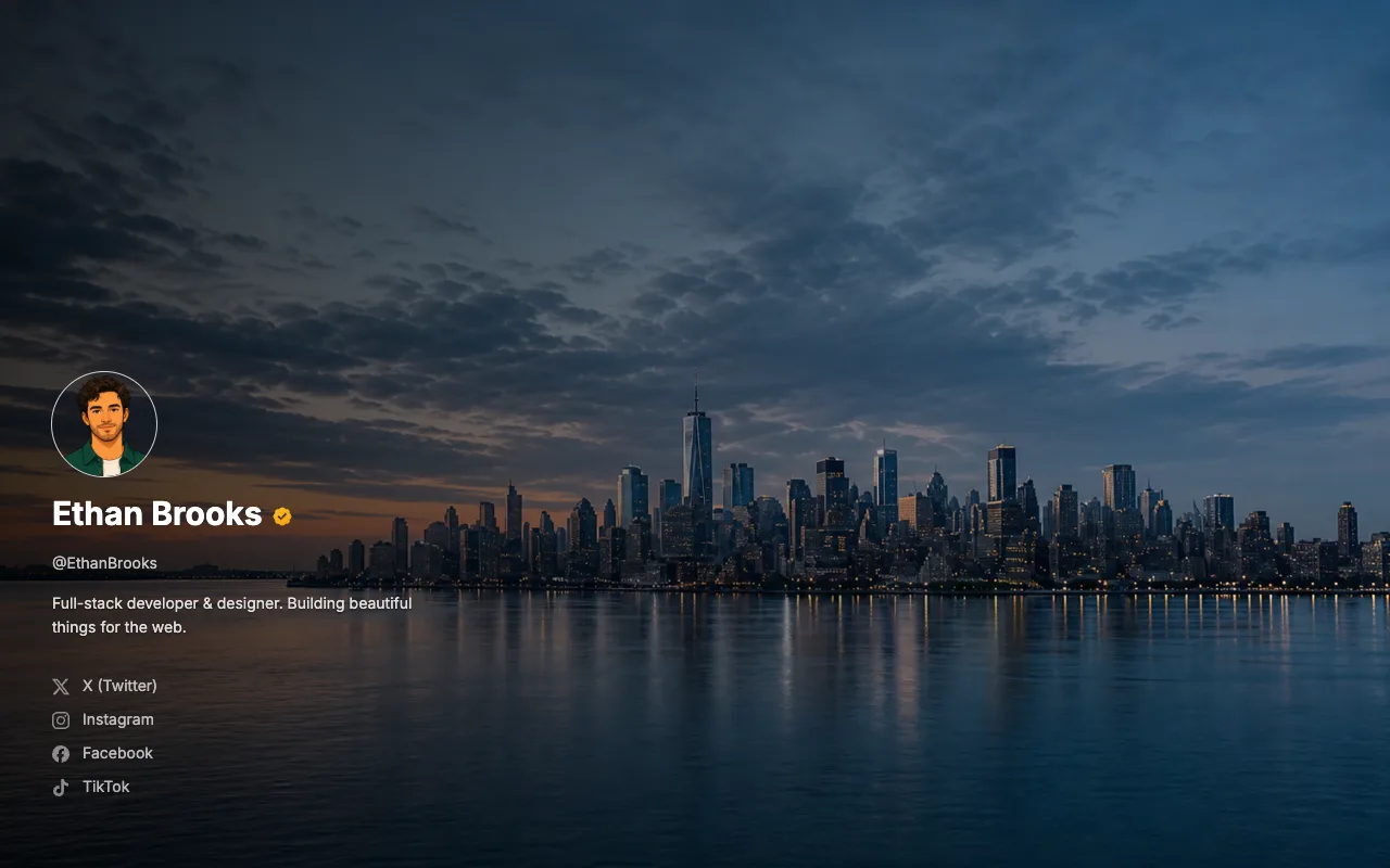
Poster Stack
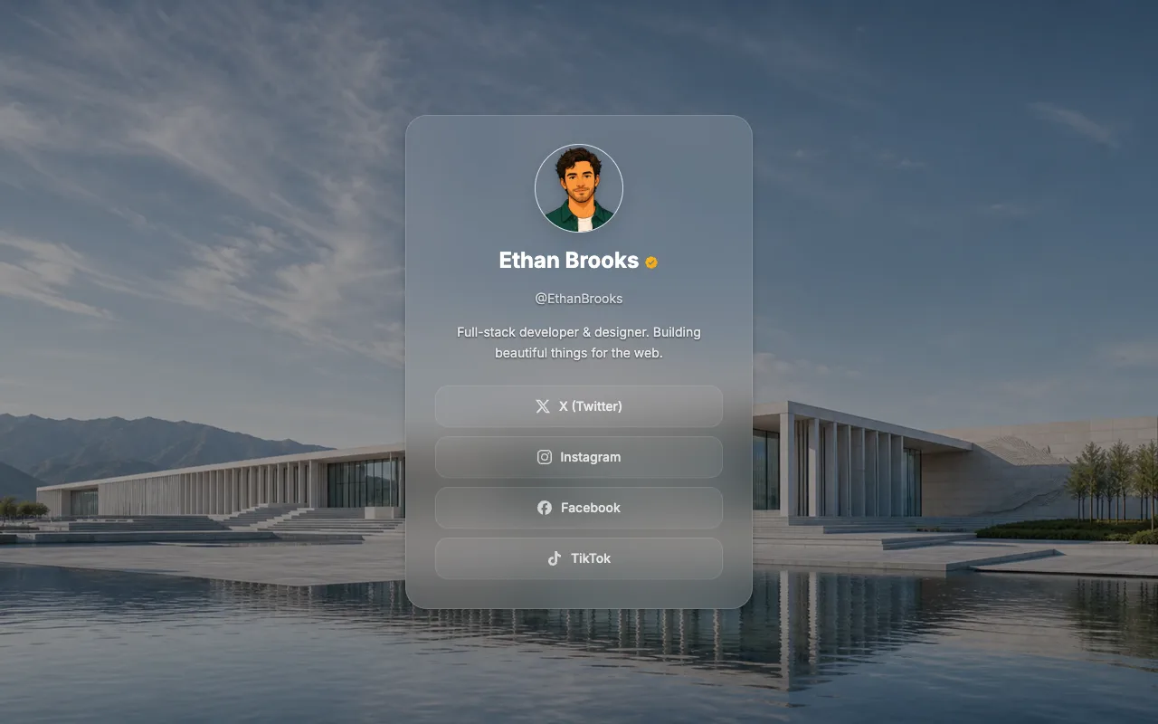
Poster Float
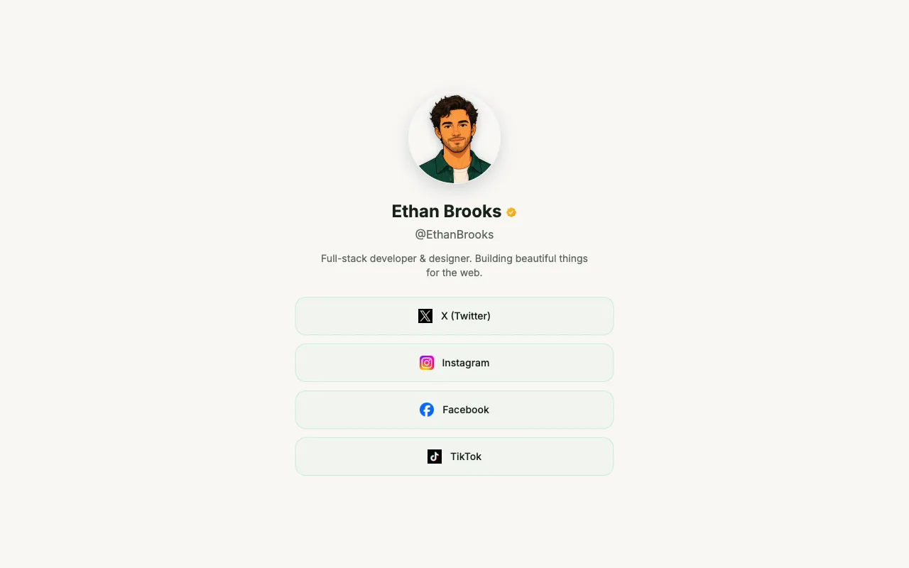
Minimal
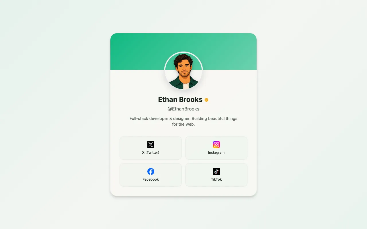
Card
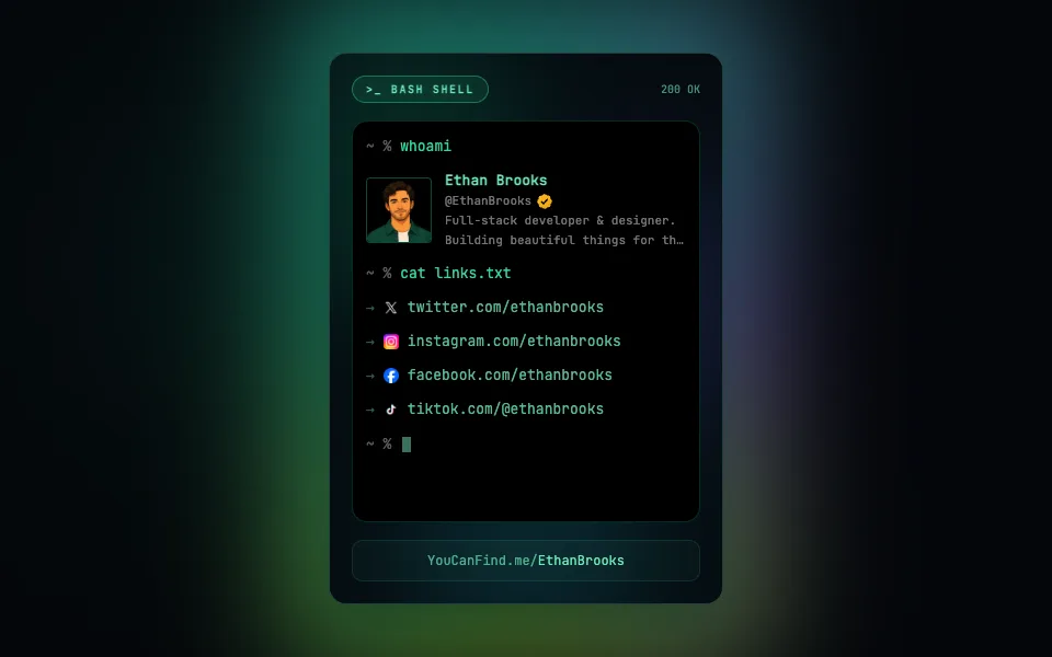
Terminal CardPRO
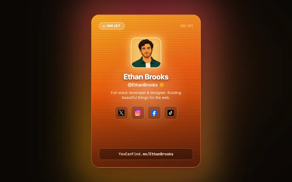
Print CardPRO
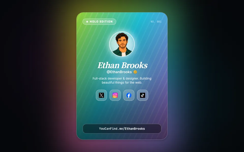
Holo CardPRO
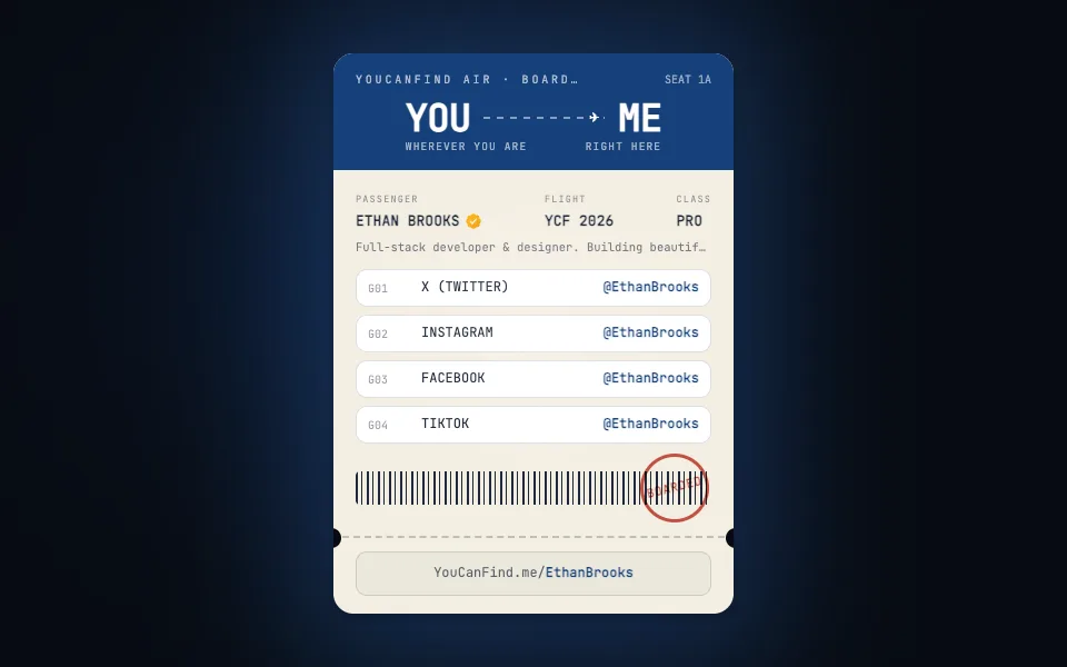
Boarding PassPRO
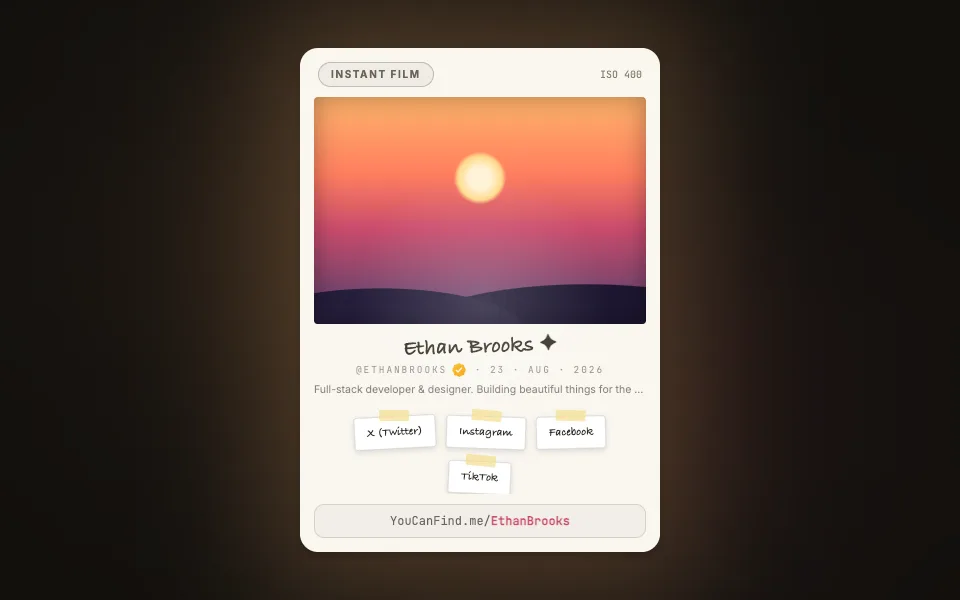
PolaroidPRO